Wheelers Rebranding
I led the brand overhaul for a multi-million dollar lumber truss company based in Rome, Georgia. The company creates building components for walls, roofs, and housing foundations.
Among other things, I art directed the redesign of the company logo, conducted internal audits, and directed the creation of their style guide. Below is a case study.
Though the company had been led by a multi-generational family of self-described “good ol’ boys,” they wanted to appeal to millennials, their hoped-for future base. Wheelers prides itself on truss design excellence, so we factored that as well.
We created a series of mood boards to explore themes. One looked at the materiality of wood and building plans. Another played with the idea of assembling components together. Another explored draftsmanship.
We eventually honed in onto two visual markers. One was a wooden arrow (shown bottom left). Much like a truss, it was made of conjoined lumber, but could stand for an arrow or a tree, depending on orientation. The other marker was the saw blades “W” shape from the original logo.
The wooden arrow (bottom left) became the design motif favored by the client.
Internal Audit Card Sorting
Prior to mood boarding, we performed an internal audit to evaluate the Wheeler’s brand on the following:
◦ Existing language
◦ Marketing materials
◦ Brand assets
◦ Business strategy
◦ Market positioning
◦ Competitive analysis
◦ SWOT analysis
Card sorting, part of our strategic design toolbox, helped us identify big ideas and key findings. It also helped us devise questions to ask during stakeholder interviews with senior Wheelers staff.
The excellent resource that guided our process is the fifth edition of Designing Brand Identity by Alina Wheeler. We also referenced some fantastic style guides from Standards Manual.


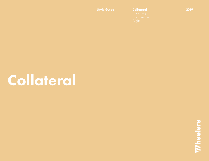
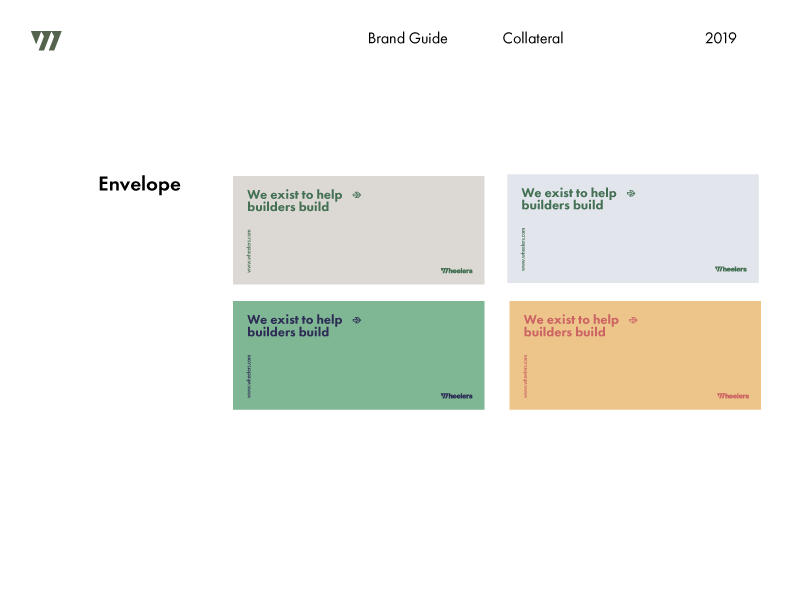
Above, selected pages from the Wheelers Style Guide
Designer: Abby Yang
Creative Director: Hanul Bahm
I realize the temptation to jump straight into designing is high, given deadlines and constraints. We held back and did the opposite. We went through the rigor of understanding what the company meant to its staff, its industry, and their clients. We worked with the company to articulate a business plan. We analyzed where the company had been and wished to go. The process helped us design something that would carry them into the future.
The original Wheelers logo
Screenshots from the previous Wheelers website


